Finding clarity in the
void .
How fewer choices, clearer spacing, and honest hierarchy make websites easier to use.

A blank page makes everyone nervous except me. Hand someone an empty layout and the first instinct is always more: more copy, more modules, more proof, one more section somebody might ask about in six months. Most of the time the right move is to pick the two things that actually matter and let the rest of the page stay empty.
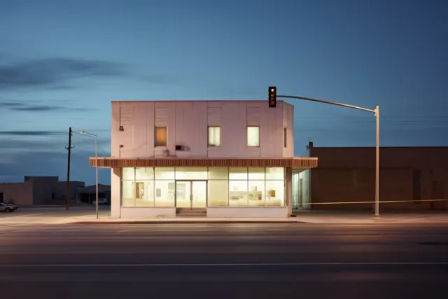
I learned this again building the operator dashboard for RideReserve this spring. The first draft tried to put every metric a fleet manager might want on one screen at once: bookings, fuel levels, maintenance flags, driver status, the works. It looked thorough and felt useless. The version that shipped cuts almost two thirds of that, and it does the actual job better. Glance at the screen, spot the one trolley that needs fuel, move on. Cutting it down didn't make the dashboard do less work. It made the one job it has to do obvious.
Most messy sites I inherit are not short on design work. They are short on decisions. Dense nav, three competing calls to action, a chat widget, a promo banner, and a paragraph that runs eleven lines, all shouting for attention on the same screen. Space is how I put them back in order, not by adding more design, by taking the fight out of the page.

Margins are not wasted real estate. They are how the eye finds its way back to the start of the next line. Leading sets the pace the same way a drummer sets the pace of a song. Too tight and everything feels rushed. Too loose and the ideas stop talking to each other.
Interaction follows the same rule. Padding around a button makes it easier to tap and easier to understand as a button in the first place. Space between sections tells the reader that one thought ended and the next one is starting, without a divider line doing the work for me.
The hard part is defending it after launch. Someone always wants the logo bigger, or one more proof point above the fold, or a fourth link crammed into the hero next to the one that actually converts. I don't argue with taste. I show what the addition costs the visitor trying to find the button we already agreed mattered most.
This shows up in real work constantly. A pricing page needs fewer distractions, not more reassurance. A nonprofit's events page needs the date, the location, and whether there is parking, before a single line of inspirational copy. A services page needs one next step, not four equally weighted ones competing for the same click.

Good spacing doesn't announce itself. It just works. When a client tells me the new site feels easier to use, they're usually describing the space I left alone, not the design I added.
The rhythm of a quiet morning.
How I protect the quiet blocks that make design and front-end work better.
Why structure beats decoration on small business sites.
Most local sites fail before the design even matters. They hide the offer, bury proof, and make the next step feel like homework.

When Webflow is the right constraint.
Choosing editor-friendly systems without painting yourself into a corner. What Webflow is good at, when to move to code, and how to keep scope honest.