What is the MCOFU Marketing Site project?
The Massachusetts Correctional Officers Federated Union represents correctional officers across the state's prison system. The people in it work one of the…
The Massachusetts Correctional Officers Federated Union represents correctional officers across the state's prison system. The people in it work one of the…
Massachusetts Correctional Officers Federated Union.
Webflow, CMS, Member Resources

The audience is not shopping. They are checking credentials, looking for contact information, or trying to understand what the union can do for them. The information needs to be findable fast.
The design direction prioritized authority and directness. Union members under contract pressure or in a grievance situation do not have time to interpret a complicated page. Every section answers a specific question: what is MCOFU, who does it represent, what can it do for you, how do you reach someone. The structure follows that sequence without detours.
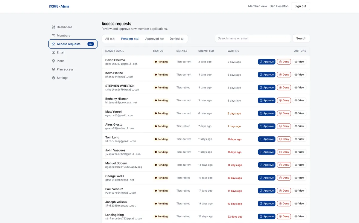
The site is built in Webflow with CMS-backed sections for news, resources, and member-facing information. Contact paths, jurisdiction details, and key union resources are structured so someone under time pressure can find what they need without wading through institutional clutter. The darker command-panel visual direction stayed in the internal grievance app; the public marketing site stays clean, direct, and readable on mobile.
Contact information, member resources, and union jurisdiction are all findable without using three levels deep. The people who need this site most are often under time pressure. The structure respects that.
A union site that looks underfunded undermines the organization it represents. The design reads as competent and direct without relying on the visual language that makes government and institutional sites feel like obstacles.
Information organized around what members and prospective members actually need to know, not around the internal org chart of the union.
Key contact paths, resource links, and jurisdiction information surface without requiring a phone call to find them.
A design that reads as serious and trustworthy. The union's credibility comes from 30 years of contract negotiation and member representation. The site supports that, it does not try to substitute for it.
Taking content from our old website and current materials and adding updated content that we could edit, instead of having to create everything from scratch, was one of the most helpful parts of the process.
Jenny Amory Board Member, Rockport Exchange

Pick a question below, or ask me anything.